Planners and designers use geographic data to understand and describe a study area. Spatial analysis can reveal useful information about an area and help you assess its suitability for or vulnerability to development activities. You can use analysis tools with geographic data to understand opportunities and risks in an area. ArcGIS GeoPlanner provides analysis tools that can help you increase your spatial awareness, so you can plan and design more effectively in a specific geographic context.
The Explore tab contains tools to help you visualize your planning area and understand how it behaves or performs.

The functionality on the Explore tab includes the following:
- Add Data—Discover datasets from ArcGIS Enterprise.
- Analysis—Run spatial analysis tools to help you understand how an area performs.
- Modeler—Identify suitability for development or an activity in an area by overlaying layers and ranking outputs.
Add Data
GeoPlanner allows you to connect to ArcGIS Enterprise and discover datasets that describe the world. Many of these datasets can be directly used in your planning projects. You can discover feature, map, and image layers. You can also discover weighted overlay models (suitability models) generated by other contributors from your organization and others. If you share your own datasets, you can discover and add these datasets to your project.
Analysis
Data analysis tools create layers for the following purposes:
- Depict how an area functions or performs.
- Depict how that performance relates to the active scenario or another polygon feature layer in a GeoPlanner dashboard chart.
GeoPlanner provides analysis and classification tools. Analysis tools allow you to create datasets that help you visualize a phenomenon in or ask a question about an area to better understand how it functions. Classification tools allow you to rank values in those datasets to help you understand suitability of an activity in that area. Ranking, through classification, helps you understand how an area performs. Classification in GeoPlanner entails mapping input values to a suitability scale of up to nine values.
GeoPlanner also includes many spatial analysis tools hosted on ArcGIS Enterprise.
GeoPlanner has two types of tools available for assessment: spatial analysis and suitability analysis. Spatial analysis tools run against feature layers and create output layers. Suitability analysis tools use weighted raster overlay to generate a new image layer item in your organization.
After you run a tool, you'll need to classify the output.
Modeler
A weighted raster overlay is a technique for modeling suitability. It helps determine the best location for an activity. GeoPlanner supports weighted overlay through the Modeler tool on the Explore tab. The Modeler tool allows you to browse and choose a service that supports weighted overlay through image layers (rasters) served from ArcGIS Server. GeoPlanner includes Esri-curated weighted overlay services. You can also create your own services if you have ArcGIS Server, ArcGIS Image Server, and ArcGIS Spatial Analyst. The output of a weighted raster overlay analysis is an image layer item type in your organization. The output layer combines both the assessment and classification steps described above.
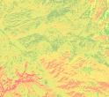
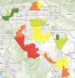
The following table lists example questions that can help understand suitability for an activity in an area and the service with some of the layers that you can combine in a weighted overlay to visualize the answer to each question. Finally, it contains sample output layer graphics and an explanation of the classification of the layer.
| Example question | Service and layers | Output | Classification |
|---|---|---|---|
Where is fire risk highest in the forest? | USA Landscape Data
|
| Green—Low fire risk Orange—Elevated fire risk Red—Highest fire risk |
Where are the best locations for growing grapes? | USA Landscape Data
|
| Green—Best locations, highly suitable Orange—Less suitable Red—Worst locations, lowest suitability |
Where are areas of highest income and highest total losses? | Custom
|
| Green—Lowest losses and incomes Yellow—Medium losses and incomes Red—Highest losses and incomes |
The Modeler tool helps you identify areas that meet your criteria by combining raster layers to produce suitability layers. These layers can also be used as assessment layers in the dashboards. You can create new or edit existing models from tools in the Modeler drop-down menu.


