A dashboard is composed of one or more elements that are designed to always occupy 100 percent of a screen. When you create a dashboard, you can create a desktop and mobile view. The layout for each view should be configured to be optimal for the device used for viewing.
The layout of a dashboard's view is composed of rows and columns. As you add elements to your view, they are added to the layout tree in the View pane. The layout tree outlines the rows and columns that make up your view, and the elements contained in them. A row describes elements that are docked side by side in the dashboard layout. A column describes elements that are docked above and below each other in the dashboard layout. You can hover over a row or column in the layout tree to highlight the elements it contains.
Desktop view layout
The default layout of a dashboard is optimized for desktop viewing. When you resize your browser, the elements resize to fit. The desktop layout contains the body, an optional header, and optional sidebar. The body contains visual elements, organized with a docking layout. A header can include a title, subtitle, icon, background image and menu, and can contain selectors. A sidebar has a title and description, and can contain selectors.
Mobile view layout
A dashboard can have an optional mobile view that contains the same or new elements. The mobile layout contains the body, an optional header, and optional drawer. The body contains visual elements, organized with a docking layout. A header can have a title and icon. A drawer is used to host selectors.
Manage layouts
You can arrange most dashboard elements by moving, resizing, stacking, and grouping them. The only elements that can't be rearranged are the header, sidebar, and drawer. These occupy a predefined space on a dashboard's view, and a view can only have one of each.
Tip:
As you are working on your dashboard's layout, save your work. To create a duplicate of your dashboard, click the Save button  , and click Save as.
Move elements
You can move elements to rearrange them on your dashboard. As you move your elements in your layout, their position in the layout tree changes.
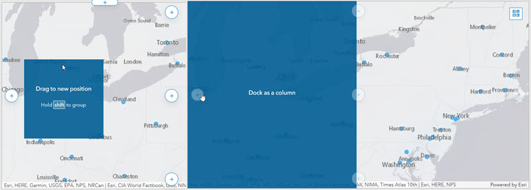
To rearrange the elements on your dashboard view, click Drag item  while moving the element toward the indicator for the desired position. Release the mouse button when the hint text changes from Drag to new position to text that includes Dock as, such as Dock as a column.

You can dock elements as rows or columns. Elements can be docked to sections of the dashboard view or to sections of other elements. For example, you can dock an element as a column to the right side of your view, or you can dock an element as a column to the right side of another element.
Resize elements
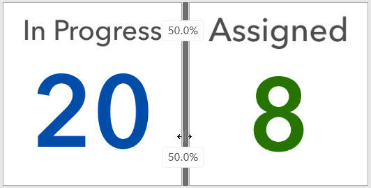
To resize an element, hover over its vertical or horizontal border until the pointer changes to crosshairs, and drag the border until the element is your desired size. As you drag your element's border, you can view the percentage of the row or column the element takes up.

You can also resize an entire row or column so that the elements contained in them are sized evenly. To resize an entire row, click the Distribute width evenly button  next to the row in the layout tree. To resize an entire column, click the Distribute height evenly button
  next to the column in the layout tree.
Stack elements
You can stack two or more elements on top of each other to create tabs for each element. When elements are tabbed, only one element is visible at a time and the other elements are hidden. The tabs allow you to select which element is visible. On a mobile view, users can navigate through the tabbed elements to view them.
Note:
Tabbed elements cannot be grouped with other elements.
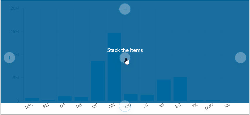
To create a tabbed view of two or more elements, click Drag item  while moving the element toward the center position indicator of the target element. Release the mouse button when the text changes to Stack the items. Alternatively, you can also create a tabbed view by adding a new element directly on top of another element.

Once an element has been added to the stack, a new tab is created. Tabs can be renamed by clicking the tab and clicking the Edit button  . You can also rearrange the order of the tabbed elements by clicking and dragging the tab.
Note:
If you have many tabs on your mobile view, you can hold the Shift key to scroll horizontally through your tabs.
Group elements
You can group elements to join them together in your dashboard layout. Unlike tabbing, grouping elements does not hide the other elements in the group. Grouping allows you to move and resize the elements as if they were only one, and hides the margins between them.
Note:
Grouped elements can be stacked with other elements or groups.
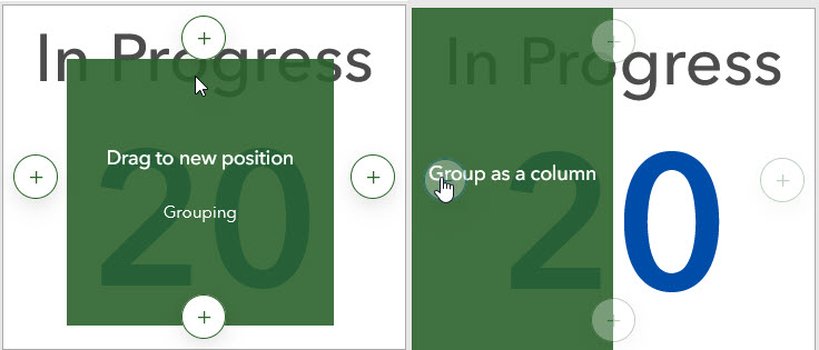
To group two elements, click Drag item  while moving the element toward the center position indicator of the target element as if you are stacking elements. However, before releasing the mouse button, press and hold the Shift key. This will cause the position indicators and the element you're moving to turn green. Release the mouse button when the hint text changes to text that contains Group as, such as Group as a column. Be sure to release the mouse button before you release the Shift key.
Alternatively, you can press and hold the Shift key when adding an element to your dashboard to add the element to a group.

You can also choose to group an entire row or column at once. When you group an entire row or column, the elements contained in them are automatically grouped together. To group an entire row or column, click the Group elements button  next to the row or column.